#buildinpublic
0 people building today
Tweet your progress with hashtag #buildinpublic to show up here.

Day 004 of my UI/UX challenge.
Honestly, I love to see my progress and I am amazed with the outcome💜.
Here, I applied my color combination skill and made my fonts as simple as possible.
I’d love you to follow me in this journey😇.
#DailyUI #buildinpublic #uidesign twitter.com/_jennifernwoye…
Honestly, I love to see my progress and I am amazed with the outcome💜.
Here, I applied my color combination skill and made my fonts as simple as possible.
I’d love you to follow me in this journey😇.
#DailyUI #buildinpublic #uidesign twitter.com/_jennifernwoye…
Another day as a UI lover to share my experience and my work. Here is my day 3 challenge UI/UX.
While doing this, I mastered how to use my grids as well as shapes to make colorful gradients. Doing this was time well spent and I enjoyed every process❤️.
#dailyui #buildinpublic
While doing this, I mastered how to use my grids as well as shapes to make colorful gradients. Doing this was time well spent and I enjoyed every process❤️.
#dailyui #buildinpublic
Day 004 of my UI/UX challenge.
Honestly, I love to see my progressing and I am amazed with the outcome💜.
Here, I applied my color combination skill and made my fonts as simple as possible.
I’d love you to follow me in this journey😇.
#DailyUI #buildinpublic #uidesign twitter.com/_jennifernwoye…
Honestly, I love to see my progressing and I am amazed with the outcome💜.
Here, I applied my color combination skill and made my fonts as simple as possible.
I’d love you to follow me in this journey😇.
#DailyUI #buildinpublic #uidesign twitter.com/_jennifernwoye…
Another day as a UI lover to share my experience and my work. Here is my day 3 challenge UI/UX.
While doing this, I mastered how to use my grids as well as shapes to make colorful gradients. Doing this was time well spent and I enjoyed every process❤️.
#dailyui #buildinpublic
While doing this, I mastered how to use my grids as well as shapes to make colorful gradients. Doing this was time well spent and I enjoyed every process❤️.
#dailyui #buildinpublic

#DailyUI 89/100!
Yo, guys! "Terms of Service" design is here.
Check the animation below, please👇
I would appreciate any opinions and criticism.
#design #uxui #uiux #uxdesign #uiuxdesign #figma #DesignInspiration #designer #buildinpublic #ChatGPT #Motivation #DesignThinking
Yo, guys! "Terms of Service" design is here.
Check the animation below, please👇
I would appreciate any opinions and criticism.
#design #uxui #uiux #uxdesign #uiuxdesign #figma #DesignInspiration #designer #buildinpublic #ChatGPT #Motivation #DesignThinking
Another day as a UI lover to share my experience and my work. Here is my day 3 challenge UI/UX.
While doing this, I mastered how to use my grids as well as shapes to make colorful gradients. Doing this was time well spent and I enjoyed every process❤️.
#dailyui #buildinpublic
While doing this, I mastered how to use my grids as well as shapes to make colorful gradients. Doing this was time well spent and I enjoyed every process❤️.
#dailyui #buildinpublic
#DailyUI 88/100!
Hey, guys! "Avatar" design is here.
Check the animation below, please👇
I would appreciate any opinions and criticism.
#design #uxui #uiux #uxdesign #uiuxdesign #figma #DesignInspiration #designer #buildinpublic #ChatGPT #Motivation #DesignThinking #blog
Hey, guys! "Avatar" design is here.
Check the animation below, please👇
I would appreciate any opinions and criticism.
#design #uxui #uiux #uxdesign #uiuxdesign #figma #DesignInspiration #designer #buildinpublic #ChatGPT #Motivation #DesignThinking #blog
#DailyUI 87/100!
Have a good week, guys! "Tooltip" design is here.
I would appreciate any opinions and criticism.
#design #uxui #uiux #uxdesign #uiuxdesign #figma #DesignInspiration #designer #buildinpublic #ChatGPT #Motivation #DesignThinking #blog
Have a good week, guys! "Tooltip" design is here.
I would appreciate any opinions and criticism.
#design #uxui #uiux #uxdesign #uiuxdesign #figma #DesignInspiration #designer #buildinpublic #ChatGPT #Motivation #DesignThinking #blog

How to create Bootstrap Nav Tabs HTML CSS Custom Design | HTML CSS Boots... youtu.be/yaNyS9vziUY via @YouTube
#buildinpublic #techtwitter #100Devs #catchupcrew #UI #DailyUI #UIdesign #MarketingDigital #MarketingStrategy #blog #DevOps #mern #react #node #javascript #mongodb
#buildinpublic #techtwitter #100Devs #catchupcrew #UI #DailyUI #UIdesign #MarketingDigital #MarketingStrategy #blog #DevOps #mern #react #node #javascript #mongodb
Good day design lovers.
It’s the second day of my UI/UX challenge and here’s what I could come up with.
This design took me 3 hours and was quite challenging.
With time, I’ll improve on my skills🤞.
I’d love you to walk through this journey with me.
#DailyUI #buildinpublic
It’s the second day of my UI/UX challenge and here’s what I could come up with.
This design took me 3 hours and was quite challenging.
With time, I’ll improve on my skills🤞.
I’d love you to walk through this journey with me.
#DailyUI #buildinpublic

There are many ways to authenticate yourself, whether you use a third-party login or email verification.
How to choose? This is the way I've compiled all the authentication and interaction logic so far.
Take a look👉figma.com/file/LJ6Drb5z3…
#uidesign #dailyui #buildinpublic
How to choose? This is the way I've compiled all the authentication and interaction logic so far.
Take a look👉figma.com/file/LJ6Drb5z3…
#uidesign #dailyui #buildinpublic
It’s the first day of my UI/UX design challenge and this is the little piece I could come up with.
It’s my first trial - my first design.
Join me as I walk through this journey😇.
#DailyUI #buildinpublic
It’s my first trial - my first design.
Join me as I walk through this journey😇.
#DailyUI #buildinpublic
#DailyUI 86/100!
Yo, guys! "Progress Bar" design is here.
I would appreciate any opinions and criticism.
Have an amazing weekend! 💞
#design #uxui #uiux #uxdesign #uiuxdesign #figma #DesignInspiration #designer #buildinpublic #ChatGPT #Motivation #DesignThinking #blog
Yo, guys! "Progress Bar" design is here.
I would appreciate any opinions and criticism.
Have an amazing weekend! 💞
#design #uxui #uiux #uxdesign #uiuxdesign #figma #DesignInspiration #designer #buildinpublic #ChatGPT #Motivation #DesignThinking #blog
#DailyUI 85/100
Hey, guys! "Pagination" design is here.
Check the animation below, please👇
I would appreciate any opinions and criticism!
#design #uxui #uiux #uxdesign #uiuxdesign #figma #DesignInspiration #designer #buildinpublic #ChatGPT #Motivation #DesignThinking #blog
Hey, guys! "Pagination" design is here.
Check the animation below, please👇
I would appreciate any opinions and criticism!
#design #uxui #uiux #uxdesign #uiuxdesign #figma #DesignInspiration #designer #buildinpublic #ChatGPT #Motivation #DesignThinking #blog
#DailyUI 84/100
Hey, guys! "Badge design is here.
I would appreciate any opinions and criticism!
#design #uxui #uiux #uxdesign #uiuxdesign #figma #DesignInspiration #designer #buildinpublic #ChatGPT #Motivation #DesignThinking #blog
Hey, guys! "Badge design is here.
I would appreciate any opinions and criticism!
#design #uxui #uiux #uxdesign #uiuxdesign #figma #DesignInspiration #designer #buildinpublic #ChatGPT #Motivation #DesignThinking #blog
#DailyUI 83/100
Yo, guys! "Button" design is here.
I would appreciate any opinions and criticism!
#design #uxui #uiux #uxdesign #uiuxdesign #figma #DesignInspiration #designer #buildinpublic #ChatGPT #Motivation #DesignThinking #blog
Yo, guys! "Button" design is here.
I would appreciate any opinions and criticism!
#design #uxui #uiux #uxdesign #uiuxdesign #figma #DesignInspiration #designer #buildinpublic #ChatGPT #Motivation #DesignThinking #blog
#DailyUI 82/100
Have a good week, guys! "Form" design is here.
I would appreciate any opinions and criticism!
#design #uxui #uiux #uxdesign #uiuxdesign #figma #DesignInspiration #designer #buildinpublic #ChatGPT #Motivation #DesignThinking #blog
Have a good week, guys! "Form" design is here.
I would appreciate any opinions and criticism!
#design #uxui #uiux #uxdesign #uiuxdesign #figma #DesignInspiration #designer #buildinpublic #ChatGPT #Motivation #DesignThinking #blog
#DailyUI 81/100
Yoo, guys! "Status Update" design is here.
Check the animation below👇
I would appreciate any opinions and criticism!
#design #uxui #uiux #uxdesign #uiuxdesign #figma #DesignInspiration #designer #buildinpublic #ChatGPT #Motivation #DesignThinking #blog
Yoo, guys! "Status Update" design is here.
Check the animation below👇
I would appreciate any opinions and criticism!
#design #uxui #uiux #uxdesign #uiuxdesign #figma #DesignInspiration #designer #buildinpublic #ChatGPT #Motivation #DesignThinking #blog
#DailyUI 80/100
Hey, guys! "Date Picker" design is here.
Check the animation below👇
I would appreciate any opinions and criticism!
#design #uxui #uiux #uxdesign #uiuxdesign #figma #DesignInspiration #designer #buildinpublic #ChatGPT #Motivation #DesignThinking #blog
Hey, guys! "Date Picker" design is here.
Check the animation below👇
I would appreciate any opinions and criticism!
#design #uxui #uiux #uxdesign #uiuxdesign #figma #DesignInspiration #designer #buildinpublic #ChatGPT #Motivation #DesignThinking #blog
Check out my Gig on Fiverr: do html landing page psd, xd, sketch, figma to html convert fiverr.com/s/Qy2Egj
#buildinpublic #Python #coder #developer #sofware #techtwitter #indiehackers #webDev #frontEnd #CSS #100DaysOfCode #quiz #js #code #programming #uidesign #DailyUI #js
#buildinpublic #Python #coder #developer #sofware #techtwitter #indiehackers #webDev #frontEnd #CSS #100DaysOfCode #quiz #js #code #programming #uidesign #DailyUI #js
#DailyUI 79/100
Hello, guys! "Itinerary" design is here.
Tried to make it simple.
I would appreciate any opinions and criticism!
#design #uxui #uiux #uxdesign #uiuxdesign #figma #DesignInspiration #designer #buildinpublic #ChatGPT #Motivation #DesignThinking #blog
Hello, guys! "Itinerary" design is here.
Tried to make it simple.
I would appreciate any opinions and criticism!
#design #uxui #uiux #uxdesign #uiuxdesign #figma #DesignInspiration #designer #buildinpublic #ChatGPT #Motivation #DesignThinking #blog
#DailyUI 78/100
Yo, guys! "Pending Invitation" design is here.
Mobile version for WeProg.
I would appreciate any opinions and criticism!
#design #uxui #uiux #uxdesign #uiuxdesign #figma #DesignInspiration #designer #buildinpublic #ChatGPT #Motivation #DesignThinking #blog
Yo, guys! "Pending Invitation" design is here.
Mobile version for WeProg.
I would appreciate any opinions and criticism!
#design #uxui #uiux #uxdesign #uiuxdesign #figma #DesignInspiration #designer #buildinpublic #ChatGPT #Motivation #DesignThinking #blog
Create the button component again, for variables.
Snow Dashboard UI Kit 👉 snow.byewind.com
#dailyui #buildinpublic twitter.com/figma/status/1…
Snow Dashboard UI Kit 👉 snow.byewind.com
#dailyui #buildinpublic twitter.com/figma/status/1…

Whoa, over 1 million variables have been created since launching at #Config2023 last week 🤯
twitter.com/figma/status/1…
twitter.com/figma/status/1…
#DailyUI 77/100
Heyy, guys! "Thank You" design is here.
I would appreciate any opinions and criticism!
#design #uxui #uiux #uxdesign #uiuxdesign #figma #DesignInspiration #designer #buildinpublic #ChatGPT #Motivation #DesignThinking #blog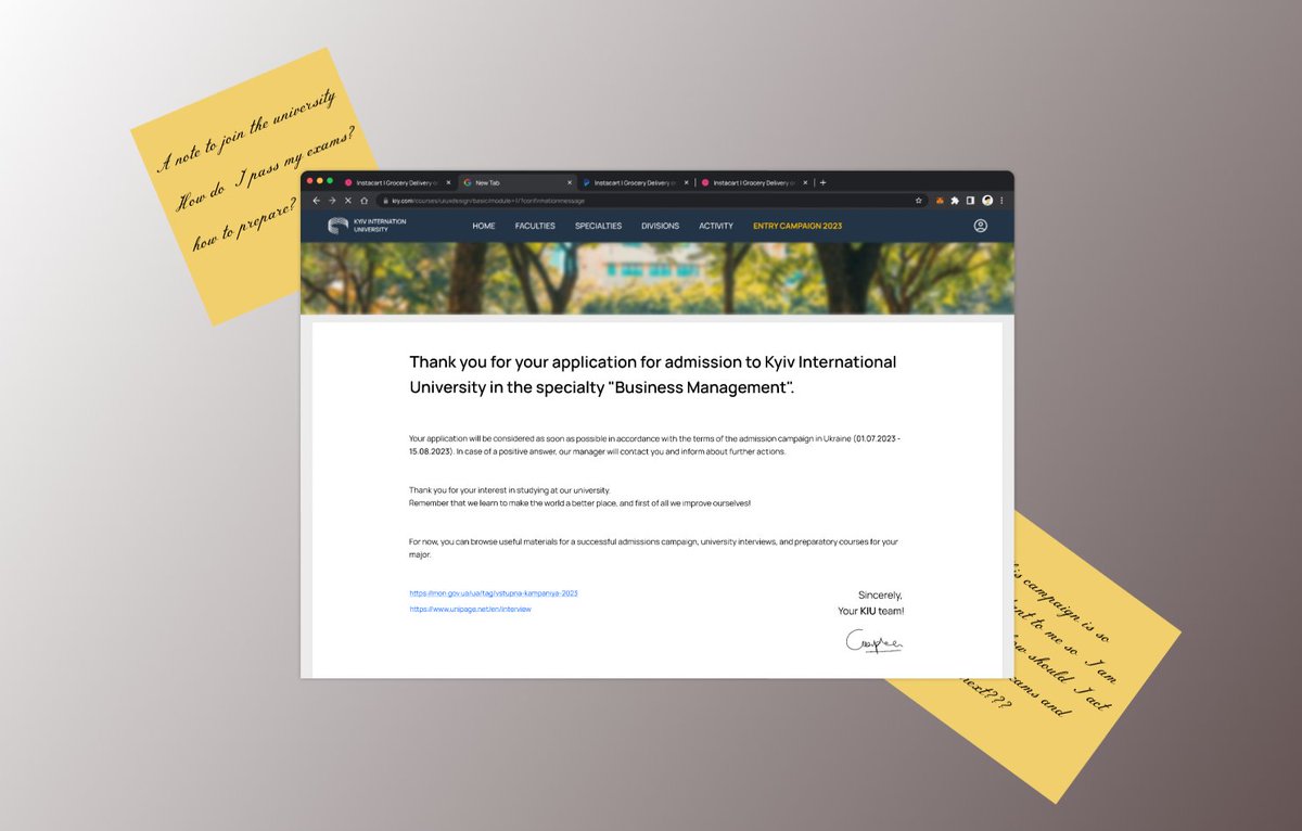
Heyy, guys! "Thank You" design is here.
I would appreciate any opinions and criticism!
#design #uxui #uiux #uxdesign #uiuxdesign #figma #DesignInspiration #designer #buildinpublic #ChatGPT #Motivation #DesignThinking #blog
The new features of Figma are great, and I'd love to use them in SnowUI, but it's going to take me some time to get used to them.
Snow Dashboard UI Kit 👉 snow.byewind.com #dailyui #buildinpublic
Snow Dashboard UI Kit 👉 snow.byewind.com #dailyui #buildinpublic
#DailyUI 76/100
Yo, guys! "Loading..." design is here.
Check the animation below👇
I would appreciate any opinions and criticism!
#design #uxui #uiux #uxdesign #uiuxdesign #figma #DesignInspiration #designer #buildinpublic #ChatGPT #Motivation #DesignThinking #blog
Yo, guys! "Loading..." design is here.
Check the animation below👇
I would appreciate any opinions and criticism!
#design #uxui #uiux #uxdesign #uiuxdesign #figma #DesignInspiration #designer #buildinpublic #ChatGPT #Motivation #DesignThinking #blog
#DailyUI 75/100
Hello, guys! "Pre-Order" design is here.
I would appreciate any opinions and criticism.
#design #uxui #uiux #uxdesign #uiuxdesign #figma #AppleVisionPro #designer #buildinpublic #ChatGPT #VisionPro #DesignThinking
Hello, guys! "Pre-Order" design is here.
I would appreciate any opinions and criticism.
#design #uxui #uiux #uxdesign #uiuxdesign #figma #AppleVisionPro #designer #buildinpublic #ChatGPT #VisionPro #DesignThinking
#DailyUI 74/100
Yo, guys! "Download App" design is here.
I would appreciate any opinions and criticism.
#design #uxui #uiux #uxdesign #uiuxdesign #figma #AppleVisionPro #designer #buildinpublic #ChatGPT #VisionPro #DesignThinking
Yo, guys! "Download App" design is here.
I would appreciate any opinions and criticism.
#design #uxui #uiux #uxdesign #uiuxdesign #figma #AppleVisionPro #designer #buildinpublic #ChatGPT #VisionPro #DesignThinking
#DailyUI 73/100
Hi, guys! "Virtual Reality" design is here.
Trying to play with Vision Pro design again
I would appreciate any opinions and criticism.
#design #uxui #uiux #uxdesign #uiuxdesign #figma #AppleVisionPro #designer #buildinpublic #ChatGPT #VisionPro #DesignThinking
Hi, guys! "Virtual Reality" design is here.
Trying to play with Vision Pro design again
I would appreciate any opinions and criticism.
#design #uxui #uiux #uxdesign #uiuxdesign #figma #AppleVisionPro #designer #buildinpublic #ChatGPT #VisionPro #DesignThinking
#DailyUI 72/100
Have a good week, guys! "Image Slider" design is here.
Another case for DRIPSN!
I would appreciate any opinions and criticism.
#design #uxui #uiux #uxdesign #uiuxdesign #figma #AppleVisionPro #designer #buildinpublic #ChatGPT #VisionPro #DesignThinking
Have a good week, guys! "Image Slider" design is here.
Another case for DRIPSN!
I would appreciate any opinions and criticism.
#design #uxui #uiux #uxdesign #uiuxdesign #figma #AppleVisionPro #designer #buildinpublic #ChatGPT #VisionPro #DesignThinking
Check your inbox
Maybe there's something good in it😊
Snow Dashboard UI Kit 👉 snow.byewind.com
#dailyui #buildinpublic
Maybe there's something good in it😊
Snow Dashboard UI Kit 👉 snow.byewind.com
#dailyui #buildinpublic
#DailyUI 71/100
Yo, guys! "Schedule" design is here.
Continuing to use my university's page design ☺️
I would appreciate any opinions and criticism.
#design #uxui #uiux #uxdesign #uiuxdesign #figma #AppleVisionPro #designer #buildinpublic #ChatGPT #VisionPro #DesignThinking
Yo, guys! "Schedule" design is here.
Continuing to use my university's page design ☺️
I would appreciate any opinions and criticism.
#design #uxui #uiux #uxdesign #uiuxdesign #figma #AppleVisionPro #designer #buildinpublic #ChatGPT #VisionPro #DesignThinking
#DailyUI 70/100
Hey, guys! "Event Listing" design is here.
Made my university's page design 🟢🟡
I would appreciate any opinions and criticism.
#design #uxui #uiux #uxdesign #uiuxdesign #figma #AppleVisionPro #designer #buildinpublic #ChatGPT #VisionPro #DesignThinking
Hey, guys! "Event Listing" design is here.
Made my university's page design 🟢🟡
I would appreciate any opinions and criticism.
#design #uxui #uiux #uxdesign #uiuxdesign #figma #AppleVisionPro #designer #buildinpublic #ChatGPT #VisionPro #DesignThinking
One of the reasons why AI can't replace designers is that AI can't evaluate how good or bad a design is, because AI can't understand how people feel. Unless we tell it to.
I create SnowUI in Figma 👉 snow.byewind.com
#dailyui #buildinpublic
I create SnowUI in Figma 👉 snow.byewind.com
#dailyui #buildinpublic
#DailyUI 69/100
Yo, guys!
"Trending" design is here.
Check the animation below👇
I would appreciate any opinions and criticism.
#design #uxui #uiux #uxdesign #uiuxdesign #figma #AppleVisionPro #designer #buildinpublic #ChatGPT #VisionPro #DesignThinking
Yo, guys!
"Trending" design is here.
Check the animation below👇
I would appreciate any opinions and criticism.
#design #uxui #uiux #uxdesign #uiuxdesign #figma #AppleVisionPro #designer #buildinpublic #ChatGPT #VisionPro #DesignThinking
#DailyUI 68/100
Have a great week, guys!
"Flight Search" design is here.
I would appreciate any opinions and criticism.
#design #uxui #uiux #uxdesign #uiuxdesign #figma #AppleVisionPro #designer #buildinpublic #ChatGPT #VisionPro #DesignThinking
Have a great week, guys!
"Flight Search" design is here.
I would appreciate any opinions and criticism.
#design #uxui #uiux #uxdesign #uiuxdesign #figma #AppleVisionPro #designer #buildinpublic #ChatGPT #VisionPro #DesignThinking
#DailyUI 67/100
Have a great week, guys! "Hotel Booking" design is here.
Just wanna do smth fun 😅
I would appreciate any opinions and criticism.
#design #uxui #uiux #uxdesign #uiuxdesign #figma #AppleVisionPro #designer #buildinpublic #ChatGPT #VisionPro #DesignThinking
Have a great week, guys! "Hotel Booking" design is here.
Just wanna do smth fun 😅
I would appreciate any opinions and criticism.
#design #uxui #uiux #uxdesign #uiuxdesign #figma #AppleVisionPro #designer #buildinpublic #ChatGPT #VisionPro #DesignThinking
#DailyUI 66/100
Yo, guys! "Statistics" design is here.
Wanted to play with Apple Vision Pro 😅
I would appreciate any opinions and criticism.
#design #uxui #uiux #uxdesign #uiuxdesign #figma #AppleVisionPro #designer #buildinpublic #ChatGPT #VisionPro #DesignThinking
Yo, guys! "Statistics" design is here.
Wanted to play with Apple Vision Pro 😅
I would appreciate any opinions and criticism.
#design #uxui #uiux #uxdesign #uiuxdesign #figma #AppleVisionPro #designer #buildinpublic #ChatGPT #VisionPro #DesignThinking
New design of the Sign In page
1. Removed the "Sign in with Apple" button text
Because such buttons have been around for many years, users already know what they do, so the text prompt can be omitted.
Learn More 👉 snow.byewind.com
#dailyui #buildinpublic
1. Removed the "Sign in with Apple" button text
Because such buttons have been around for many years, users already know what they do, so the text prompt can be omitted.
Learn More 👉 snow.byewind.com
#dailyui #buildinpublic
#DailyUI 65/100
Hello, guys! "Notes Widget" design is here.
I would appreciate any opinions and criticism.
#design #uxui #uiux #uxdesign #uiuxdesign #figma #DesignInspiration #designer #buildinpublic #ChatGPT #Motivation #DesignThinking
Hello, guys! "Notes Widget" design is here.
I would appreciate any opinions and criticism.
#design #uxui #uiux #uxdesign #uiuxdesign #figma #DesignInspiration #designer #buildinpublic #ChatGPT #Motivation #DesignThinking
#DailyUI 64/100
Hello, guys! "Select User Type" design is here.
Today's design is quite simple.
I would appreciate any opinions and criticism.
#design #uxui #uiux #uxdesign #uiuxdesign #figma #DesignInspiration #designer #buildinpublic #ChatGPT #Motivation #DesignThinking
Hello, guys! "Select User Type" design is here.
Today's design is quite simple.
I would appreciate any opinions and criticism.
#design #uxui #uiux #uxdesign #uiuxdesign #figma #DesignInspiration #designer #buildinpublic #ChatGPT #Motivation #DesignThinking
#DailyUI 63/100
Yo! "Best of" design is here.
Somehow I didn't get the task in the mail again
I would appreciate any opinions and criticism.
#design #uxui #uiux #uxdesign #uiuxdesign #figma #DesignInspiration #designer #buildinpublic #ChatGPT #Motivation #DesignThinking
Yo! "Best of" design is here.
Somehow I didn't get the task in the mail again
I would appreciate any opinions and criticism.
#design #uxui #uiux #uxdesign #uiuxdesign #figma #DesignInspiration #designer #buildinpublic #ChatGPT #Motivation #DesignThinking
#DailyUI 62/100
Hey, guys! "Workout of the day" design is here.
I would appreciate any opinions and criticism.
Have a great week!
#design #uxui #uiux #uxdesign #uiuxdesign #figma #DesignInspiration #designer #buildinpublic #ChatGPT #Motivation #DesignThinking #blog
Hey, guys! "Workout of the day" design is here.
I would appreciate any opinions and criticism.
Have a great week!
#design #uxui #uiux #uxdesign #uiuxdesign #figma #DesignInspiration #designer #buildinpublic #ChatGPT #Motivation #DesignThinking #blog
App Sign up process design
Whether to use password or SMS verification to sign in, this is not only a problem that needs to be considered by product design but also by UX designers.
Which way do you like?
Learn More 👉 snow.byewind.com
#dailyui #buildinpublic
Whether to use password or SMS verification to sign in, this is not only a problem that needs to be considered by product design but also by UX designers.
Which way do you like?
Learn More 👉 snow.byewind.com
#dailyui #buildinpublic
#DailyUI 61/100
Hey guys! "Redeem Coupon" design is here!
I would appreciate any opinions and criticism!
#design #uxui #uiux #uxdesign #uiuxdesign #figma #DesignInspiration #designer #buildinpublic #ChatGPT #Motivation #DesignThinking #blog
Hey guys! "Redeem Coupon" design is here!
I would appreciate any opinions and criticism!
#design #uxui #uiux #uxdesign #uiuxdesign #figma #DesignInspiration #designer #buildinpublic #ChatGPT #Motivation #DesignThinking #blog
#DailyUI 60/100
Helloo! "Color Picker" design is here!
DRIPSN project is back (again)!
I would appreciate any opinions and criticism!
#design #uxui #uiux #uxdesign #uiuxdesign #figma #DesignInspiration #designer #buildinpublic #ChatGPT #Motivation #DesignThinking #blog
Helloo! "Color Picker" design is here!
DRIPSN project is back (again)!
I would appreciate any opinions and criticism!
#design #uxui #uiux #uxdesign #uiuxdesign #figma #DesignInspiration #designer #buildinpublic #ChatGPT #Motivation #DesignThinking #blog
I will be your good front-end developer fiverr.com/s/gByb8W
#dailyui #challenge #figma #design #mobiledesign #uichallenge #CloudFestUSA #graphic #graphicdesign #designer #uiux #ui #ux #uiuxdesign #buildinpublic #indiedev #marketing #design #designinspiration #webdev #react
#dailyui #challenge #figma #design #mobiledesign #uichallenge #CloudFestUSA #graphic #graphicdesign #designer #uiux #ui #ux #uiuxdesign #buildinpublic #indiedev #marketing #design #designinspiration #webdev #react
#DailyUI 59/100
Hey! "Background Pattern" design is here!
I would appreciate any opinions and criticism!
#design #uxui #uiux #uxdesign #uiuxdesign #figma #DesignInspiration #designer #buildinpublic #ChatGPT #Motivation #DesignThinking #blog
Hey! "Background Pattern" design is here!
I would appreciate any opinions and criticism!
#design #uxui #uiux #uxdesign #uiuxdesign #figma #DesignInspiration #designer #buildinpublic #ChatGPT #Motivation #DesignThinking #blog
#DailyUI 58/100
Yo! "Shopping Cart" design is here!
Another reuse of my DRIPSN project
I would appreciate any opinions and criticism!
#design #uxui #uiux #uxdesign #uiuxdesign #figma #DesignInspiration #designer #buildinpublic #ChatGPT #Motivation #DesignThinking #blog
Yo! "Shopping Cart" design is here!
Another reuse of my DRIPSN project
I would appreciate any opinions and criticism!
#design #uxui #uiux #uxdesign #uiuxdesign #figma #DesignInspiration #designer #buildinpublic #ChatGPT #Motivation #DesignThinking #blog
I will convert xd to html css bootstrap5 responsive figma, zeplin, pdf to html website fiverr.com/s/e56N24
#buildinpublic #react #database #Dailyui #figma #uiux #uidesign #uiuxdesign #uidesigner #notification #popup #overlay #cloud #marketing #business #entrepreneurship
#buildinpublic #react #database #Dailyui #figma #uiux #uidesign #uiuxdesign #uidesigner #notification #popup #overlay #cloud #marketing #business #entrepreneurship
#DailyUI 57/100
Hellooo! "Video Player" design is here.
Have a great week, everybody!
I would appreciate any opinions and criticism!
#design #uxui #uiux #uxdesign #uiuxdesign #figma #DesignInspiration #designer #buildinpublic #ChatGPT #Motivation #DesignThinking #blog
Hellooo! "Video Player" design is here.
Have a great week, everybody!
I would appreciate any opinions and criticism!
#design #uxui #uiux #uxdesign #uiuxdesign #figma #DesignInspiration #designer #buildinpublic #ChatGPT #Motivation #DesignThinking #blog
#DailyUI 56/100
Hey guys! "Breadcrumbs" design is here.
I would appreciate any opinions and criticism!
Have a nice weekends, cya! 💞
#design #uxui #uiux #uxdesign #uiuxdesign #figma #DesignInspiration #designer #buildinpublic #ChatGPT #Motivation #DesignThinking #blog
Hey guys! "Breadcrumbs" design is here.
I would appreciate any opinions and criticism!
Have a nice weekends, cya! 💞
#design #uxui #uiux #uxdesign #uiuxdesign #figma #DesignInspiration #designer #buildinpublic #ChatGPT #Motivation #DesignThinking #blog
#DailyUI 55/100
Have a good one! "Icon Set" design is here.
Check the icon set below👇
I would appreciate any opinions and criticism!
#design #uxui #uiux #uxdesign #uiuxdesign #figma #DesignInspiration #designer #buildinpublic #ChatGPT #Motivation #DesignThinking #blog
Have a good one! "Icon Set" design is here.
Check the icon set below👇
I would appreciate any opinions and criticism!
#design #uxui #uiux #uxdesign #uiuxdesign #figma #DesignInspiration #designer #buildinpublic #ChatGPT #Motivation #DesignThinking #blog
#DailyUI 54/100
Hey, guys! "Confirmation" design is here.
Check the animation below👇
I would appreciate any opinions and criticism!
#design #uxui #uiux #uxdesign #uiuxdesign #figma #DesignInspiration #designer #buildinpublic #ChatGPT #Motivation #DesignThinking #blog
Hey, guys! "Confirmation" design is here.
Check the animation below👇
I would appreciate any opinions and criticism!
#design #uxui #uiux #uxdesign #uiuxdesign #figma #DesignInspiration #designer #buildinpublic #ChatGPT #Motivation #DesignThinking #blog
Theme setting - It is difficult for this type of page to have great innovation in interactive design, because the frequency of use of the page must be considered.
Learn More 👉 snow.byewind.com
#dailyui #buildinpublic twitter.com/FarewelltoWind…
Learn More 👉 snow.byewind.com
#dailyui #buildinpublic twitter.com/FarewelltoWind…
Recently I've been working on some pages in the settings, and these pages make me feel boring, I think designers don't like to make these pages.
So let me do it, I'll get them done, and you can save time for more interesting designs.
👉 snow.byewind.com
#dailyui
So let me do it, I'll get them done, and you can save time for more interesting designs.
👉 snow.byewind.com
#dailyui
#DailyUI 53/100
What a good day to design! "Header Navigation" is here
Check the animation 👇
I would appreciate any opinions and criticism
#design #uxui #uiux #uxdesign #uiuxdesign #figma #DesignInspiration #designer #buildinpublic #ChatGPT #Motivation #DesignThinking #blog
What a good day to design! "Header Navigation" is here
Check the animation 👇
I would appreciate any opinions and criticism
#design #uxui #uiux #uxdesign #uiuxdesign #figma #DesignInspiration #designer #buildinpublic #ChatGPT #Motivation #DesignThinking #blog
#DailyUI 52/100
Hellooo! "Logo Design" is here!
This one is for Chinese restaurant!
I would appreciate any opinions and criticism.
#design #uxui #uiux #uxdesign #uiuxdesign #figma #DesignInspiration #designer #buildinpublic #ChatGPT #Motivation #DesignThinking #blog
Hellooo! "Logo Design" is here!
This one is for Chinese restaurant!
I would appreciate any opinions and criticism.
#design #uxui #uiux #uxdesign #uiuxdesign #figma #DesignInspiration #designer #buildinpublic #ChatGPT #Motivation #DesignThinking #blog
#DailyUI 51/100
Hey, guys! "Press Page" Design is here!
Check the alternative design below👇
I would appreciate any opinions and criticism.
#design #uxui #uiux #uxdesign #uiuxdesign #figma #DesignInspiration #designer #buildinpublic #ChatGPT #Motivation #DesignThinking #blog
Hey, guys! "Press Page" Design is here!
Check the alternative design below👇
I would appreciate any opinions and criticism.
#design #uxui #uiux #uxdesign #uiuxdesign #figma #DesignInspiration #designer #buildinpublic #ChatGPT #Motivation #DesignThinking #blog
I will do html landing page psd, xd, sketch, figma to html convert fiverr.com/s/ARvLAq
#uiux #uidesign #girlsWhoCode #Entrepreneurship #StartupShowPodcast #business #ceo #DailyUI #UIUXDesigner #buildinpublic #BigData #Analytics #DataScience #AI #MachineLearning #IoT #IIoT
#uiux #uidesign #girlsWhoCode #Entrepreneurship #StartupShowPodcast #business #ceo #DailyUI #UIUXDesigner #buildinpublic #BigData #Analytics #DataScience #AI #MachineLearning #IoT #IIoT

Day 7 Daily UI design #DailyUI #LagosLivn
#GhostOfTsushima2 #buildinpublic #uidesign #uxdesign #GraphicDesigner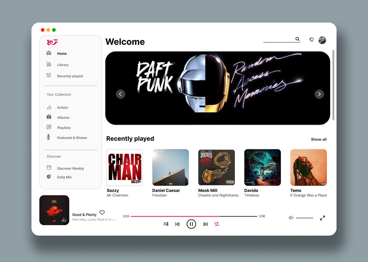
#GhostOfTsushima2 #buildinpublic #uidesign #uxdesign #GraphicDesigner
Sidebar navigation design
This is one of the most important designs in the entire product UI, and the quality of its design will determine the quality of your product design.
Learn More 👉 snow.byewind.com
#dailyui #buildinpublic
This is one of the most important designs in the entire product UI, and the quality of its design will determine the quality of your product design.
Learn More 👉 snow.byewind.com
#dailyui #buildinpublic
#DailyUI 50/100!!! 👈
Hey! "Job Listing" Design is here!
Check the animation below👇
I would appreciate any opinions and criticism.
#design #uxui #uiux #uxdesign #uiuxdesign #figma #DesignInspiration #designer #buildinpublic #ChatGPT #Motivation #DesignThinking #blog
Hey! "Job Listing" Design is here!
Check the animation below👇
I would appreciate any opinions and criticism.
#design #uxui #uiux #uxdesign #uiuxdesign #figma #DesignInspiration #designer #buildinpublic #ChatGPT #Motivation #DesignThinking #blog
#DailyUI 49/100
Yo! "Notifications" Design is here!
Check out the main design below👇
I would appreciate any opinions and criticism.
#design #uxui #uiux #uxdesign #uiuxdesign #figma #DesignInspiration #designer #buildinpublic #ChatGPT #Motivation #DesignThinking #blog
Yo! "Notifications" Design is here!
Check out the main design below👇
I would appreciate any opinions and criticism.
#design #uxui #uiux #uxdesign #uiuxdesign #figma #DesignInspiration #designer #buildinpublic #ChatGPT #Motivation #DesignThinking #blog
#DailyUI 48/100
Hiii! "Coming Soon" Design is here!
Check out the alternative design below👇
I would appreciate any opinions and criticism.
#design #uxui #uiux #uxdesign #uiuxdesign #figma #DesignInspiration #designer #buildinpublic #ChatGPT #Motivation #DesignThinking #blog
Hiii! "Coming Soon" Design is here!
Check out the alternative design below👇
I would appreciate any opinions and criticism.
#design #uxui #uiux #uxdesign #uiuxdesign #figma #DesignInspiration #designer #buildinpublic #ChatGPT #Motivation #DesignThinking #blog
#DailyUI 47/100!
Hello, guys!
New week, new designs! So "Activity Feed" design is here.
I would appreciate any opinions and criticism.
#design #uxui #uiux #uxdesign #uiuxdesign #figma #DesignInspiration #designer #buildinpublic #ChatGPT #Motivation #DesignThinking #blog
Hello, guys!
New week, new designs! So "Activity Feed" design is here.
I would appreciate any opinions and criticism.
#design #uxui #uiux #uxdesign #uiuxdesign #figma #DesignInspiration #designer #buildinpublic #ChatGPT #Motivation #DesignThinking #blog
Billing Details Design
This is a step in the registration process.
The key point of the design of this page is to make the information filled by the user appear as less as possible.
Learn More 👉 snow.byewind.com
#dailyui #buildinpublic
This is a step in the registration process.
The key point of the design of this page is to make the information filled by the user appear as less as possible.
Learn More 👉 snow.byewind.com
#dailyui #buildinpublic
#DailyUI 46/100!
Hi, guys!
"Invoice" design is here.
Check out the animation below
I would appreciate any opinions and criticism.
#design #uxui #uiux #uxdesign #uiuxdesign #figma #DesignInspiration #designer #buildinpublic #ChatGPT #Motivation #DesignThinking #blog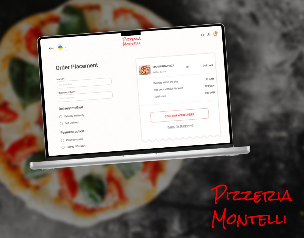
Hi, guys!
"Invoice" design is here.
Check out the animation below
I would appreciate any opinions and criticism.
#design #uxui #uiux #uxdesign #uiuxdesign #figma #DesignInspiration #designer #buildinpublic #ChatGPT #Motivation #DesignThinking #blog
#DailyUI 45/100!
Hello😇 "Info Card" design is here.
Check out the other designs below 👇
I would appreciate any opinions and criticism.
#design #uxui #uiux #uxdesign #uiuxdesign #figma #DesignInspiration #designer #buildinpublic #ChatGPT #Motivation #DesignThinking #blog
Hello😇 "Info Card" design is here.
Check out the other designs below 👇
I would appreciate any opinions and criticism.
#design #uxui #uiux #uxdesign #uiuxdesign #figma #DesignInspiration #designer #buildinpublic #ChatGPT #Motivation #DesignThinking #blog
#DailyUI 44/100!
Have a good day! "Favorites" design is here.
Check the animation below 👇
I would appreciate any opinions and criticism.
#design #uxui #uiux #uxdesign #uiuxdesign #figma #DesignInspiration #designer #buildinpublic #ChatGPT #Motivation #DesignThinking #blog
Have a good day! "Favorites" design is here.
Check the animation below 👇
I would appreciate any opinions and criticism.
#design #uxui #uiux #uxdesign #uiuxdesign #figma #DesignInspiration #designer #buildinpublic #ChatGPT #Motivation #DesignThinking #blog
Mail page in dark mode.
Designing secondary navigation in the dashboard is a difficult point, Consider whether to arrange horizontally or vertically.
This example shows the effect of vertical arrangement.
Learn More 👉 snow.byewind.com
#dailyui #buildinpublic
Designing secondary navigation in the dashboard is a difficult point, Consider whether to arrange horizontally or vertically.
This example shows the effect of vertical arrangement.
Learn More 👉 snow.byewind.com
#dailyui #buildinpublic
#DailyUI 43/100!
Yoyo! "Food/Drink Menu" design is here.
Check the animation below 👇
I would appreciate any opinions and criticism.
#design #uxui #uiux #uxdesign #uiuxdesign #figma #DesignInspiration #designer #buildinpublic #ChatGPT #Motivation #DesignThinking #blog
Yoyo! "Food/Drink Menu" design is here.
Check the animation below 👇
I would appreciate any opinions and criticism.
#design #uxui #uiux #uxdesign #uiuxdesign #figma #DesignInspiration #designer #buildinpublic #ChatGPT #Motivation #DesignThinking #blog

3D design studio website.
I experimented with 3D visuals for this design. I am happy about how things come together.
Tools:
- @figma
- @Blender
- @Photoshop
#uidesign #dailyui #buildinpublic
I experimented with 3D visuals for this design. I am happy about how things come together.
Tools:
- @figma
- @Blender
- @Photoshop
#uidesign #dailyui #buildinpublic
#DailyUI 42/100!
Hellooo! "ToDo List" design is here.
Check the animation below 👇
I would appreciate any opinions and criticism.
#design #uxui #uiux #uxdesign #uiuxdesign #figma #DesignInspiration #designer #buildinpublic #ChatGPT #Motivation #DesignThinking #blog
Hellooo! "ToDo List" design is here.
Check the animation below 👇
I would appreciate any opinions and criticism.
#design #uxui #uiux #uxdesign #uiuxdesign #figma #DesignInspiration #designer #buildinpublic #ChatGPT #Motivation #DesignThinking #blog
#DailyUI 41/100!
Yo, guys!
"Workout Tracker" design is here.
I would appreciate any opinions and criticism.
Have an amazing weekend! 💞
#design #uxui #uiux #uxdesign #uiuxdesign #figma #DesignInspiration #designer #buildinpublic #ChatGPT #Motivation #DesignThinking #blog
Yo, guys!
"Workout Tracker" design is here.
I would appreciate any opinions and criticism.
Have an amazing weekend! 💞
#design #uxui #uiux #uxdesign #uiuxdesign #figma #DesignInspiration #designer #buildinpublic #ChatGPT #Motivation #DesignThinking #blog
#DailyUI 40/100!
Hello-hello! "Recipe" design is here.
Check the animation below 👇
I would appreciate any opinions and criticism.
#design #uxui #uiux #uxdesign #uiuxdesign #figma #DesignInspiration #designer #buildinpublic #ChatGPT #Motivation #DesignThinking #blog
Hello-hello! "Recipe" design is here.
Check the animation below 👇
I would appreciate any opinions and criticism.
#design #uxui #uiux #uxdesign #uiuxdesign #figma #DesignInspiration #designer #buildinpublic #ChatGPT #Motivation #DesignThinking #blog
#DailyUI 39/100!
Hello-hello! "Testimonials" design is here.
Check the animation below 👇
I would appreciate any opinions and criticism.
#design #uxui #uiux #uxdesign #uiuxdesign #figma #DesignInspiration #designer #buildinpublic #ChatGPT #Motivation #DesignThinking #blog
Hello-hello! "Testimonials" design is here.
Check the animation below 👇
I would appreciate any opinions and criticism.
#design #uxui #uiux #uxdesign #uiuxdesign #figma #DesignInspiration #designer #buildinpublic #ChatGPT #Motivation #DesignThinking #blog
#DailyUI 38/100!
Hi, guys! "Calendar" design is here.
I would appreciate any opinions and criticism.
#design #uxui #uiux #uxdesign #uiuxdesign #figma #DesignInspiration #designer #buildinpublic #ChatGPT #Motivation #DesignThinking #blog
Hi, guys! "Calendar" design is here.
I would appreciate any opinions and criticism.
#design #uxui #uiux #uxdesign #uiuxdesign #figma #DesignInspiration #designer #buildinpublic #ChatGPT #Motivation #DesignThinking #blog
I'm designing ChatGPT's mobile app and this is the first page. I will finish all pages in the near future😊
It will be part of the ChatGPT UI Kit, check the web page 👉 figma.com/file/pTTWqClVP…
Made with Snow Dashboard UI Kit: snow.byewind.com
#dailyui #buildinpublic twitter.com/FarewelltoWind…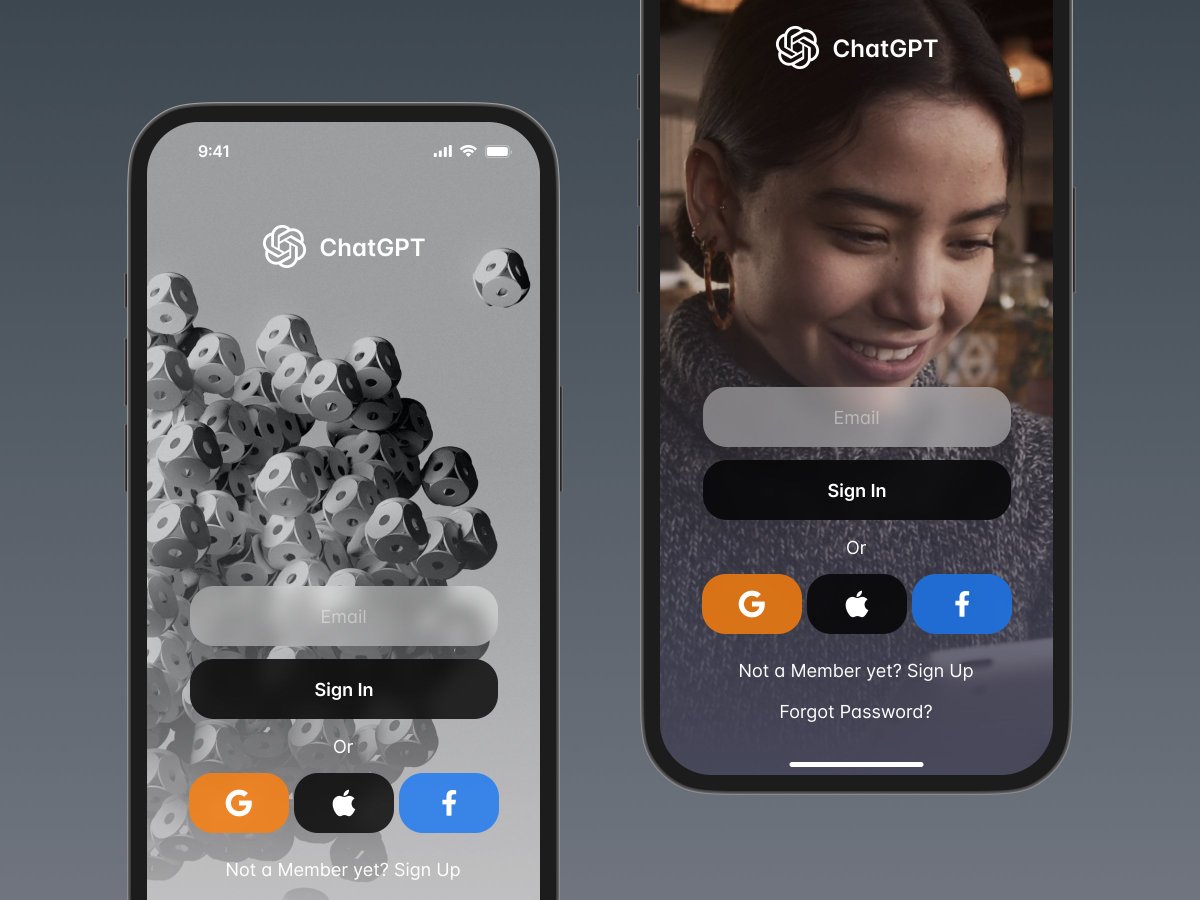
It will be part of the ChatGPT UI Kit, check the web page 👉 figma.com/file/pTTWqClVP…
Made with Snow Dashboard UI Kit: snow.byewind.com
#dailyui #buildinpublic twitter.com/FarewelltoWind…
Snow Dashboard UI Kit now supports #ChatGPT , learn more 👉figma.com/file/pTTWqClVP… twitter.com/FarewelltoWind… 
#DailyUI 37/100!
Have a good Monday! "Weather" design is here.
Check the animation below👇
I would appreciate any opinions and criticism.
#design #uxui #uiux #uxdesign #uiuxdesign #figma #DesignInspiration #designer #buildinpublic #ChatGPT #Motivation #DesignThinking #blog
Have a good Monday! "Weather" design is here.
Check the animation below👇
I would appreciate any opinions and criticism.
#design #uxui #uiux #uxdesign #uiuxdesign #figma #DesignInspiration #designer #buildinpublic #ChatGPT #Motivation #DesignThinking #blog
#DailyUI 36/100!
Hello! "Special Offer" design is here.
Check the other designs below 👇
I would appreciate any opinions and criticism.
#design #uxui #uiux #uxdesign #uiuxdesign #figma #DesignInspiration #designer #buildinpublic #ChatGPT #Motivation #DesignThinking #blog
Hello! "Special Offer" design is here.
Check the other designs below 👇
I would appreciate any opinions and criticism.
#design #uxui #uiux #uxdesign #uiuxdesign #figma #DesignInspiration #designer #buildinpublic #ChatGPT #Motivation #DesignThinking #blog

Is it just me, or did activity within different hashtags dry up over the last 3-4 days.
Specifically, #buildinpublic #indiehackers #uidesign #uiux #dailyui & #bootstrapping
I've never been on "Latest" and consistently see post 10-20 min apart.
Anyone else notice this? 🤔
Specifically, #buildinpublic #indiehackers #uidesign #uiux #dailyui & #bootstrapping
I've never been on "Latest" and consistently see post 10-20 min apart.
Anyone else notice this? 🤔
#DailyUI 35/100!
Hey, guys! "Blog Post" design is here.
Please, check animation below 👇
I would appreciate any opinions and criticism.
#design #uxui #uiux #uxdesign #uiuxdesign #figma #DesignInspiration #designer #buildinpublic #ChatGPT #Motivation #DesignThinking #blog
Hey, guys! "Blog Post" design is here.
Please, check animation below 👇
I would appreciate any opinions and criticism.
#design #uxui #uiux #uxdesign #uiuxdesign #figma #DesignInspiration #designer #buildinpublic #ChatGPT #Motivation #DesignThinking #blog
#DailyUI 34/100!
Yo! "Car Interface" design is here.
Please, check picture below 👇
I would appreciate any opinions and criticism.
#design #uxui #uiux #uxdesign #uiuxdesign #figma #DesignInspiration #designer #buildinpublic #ChatGPT #Motivation #DesignThinking
Yo! "Car Interface" design is here.
Please, check picture below 👇
I would appreciate any opinions and criticism.
#design #uxui #uiux #uxdesign #uiuxdesign #figma #DesignInspiration #designer #buildinpublic #ChatGPT #Motivation #DesignThinking
Interactive guide to tables
Made with Snow Dashboard UI Kit 👉 snow.byewind.com
#dailyui #buildinpublic
Made with Snow Dashboard UI Kit 👉 snow.byewind.com
#dailyui #buildinpublic
#DailyUI 33/100
Yo! "Product Customization" design is here.
Please, check the animation below 👇
I would appreciate any opinions and criticism 🫶
#design #uxui #uiux #uxdesign #uiuxdesign #figma #DesignInspiration #designer #buildinpublic #ChatGPT #Motivation #DesignThinking
Yo! "Product Customization" design is here.
Please, check the animation below 👇
I would appreciate any opinions and criticism 🫶
#design #uxui #uiux #uxdesign #uiuxdesign #figma #DesignInspiration #designer #buildinpublic #ChatGPT #Motivation #DesignThinking
#DailyUI 32/100!
Have a good Monday! Crowdfunding campaign design is here!
Check the animation below
I would appreciate any opinions and criticism
#design #uxui #uiux #uxdesign #uiuxdesign #figma #DesignInspiration #designer #buildinpublic #ChatGPT #Motivation #DesignThinking
Have a good Monday! Crowdfunding campaign design is here!
Check the animation below
I would appreciate any opinions and criticism
#design #uxui #uiux #uxdesign #uiuxdesign #figma #DesignInspiration #designer #buildinpublic #ChatGPT #Motivation #DesignThinking
Syntax highlighting color scheme
Free Download👉figma.com/@FarewelltoWind
#dailyui #buildinpublic
#webdesigner #designers #developers
#reactjs #vuejs #google #programming #coding #code #python #c #developer #java #javascript #css #html #softwareengineer #coder #programmer
Free Download👉figma.com/@FarewelltoWind
#dailyui #buildinpublic
#webdesigner #designers #developers
#reactjs #vuejs #google #programming #coding #code #python #c #developer #java #javascript #css #html #softwareengineer #coder #programmer
ChatGPT's new page
Made with Snow Dashboard UI Kit - an advanced Dashboard / SaaS UI kit and design system for Figma.
👉 Learn More: snow.byewind.com
#dailyui #buildinpublic #indiehacker
Made with Snow Dashboard UI Kit - an advanced Dashboard / SaaS UI kit and design system for Figma.
👉 Learn More: snow.byewind.com
#dailyui #buildinpublic #indiehacker
#DailyUI 31/100! 2nd part
Yo! Another option for "File Upload" design.
Check the animation below
I would appreciate any opinions and criticism
#design #uxui #uiux #uxdesign #uiuxdesign #figma #DesignInspiration #designer #buildinpublic #ChatGPT #Motivation #DesignThinking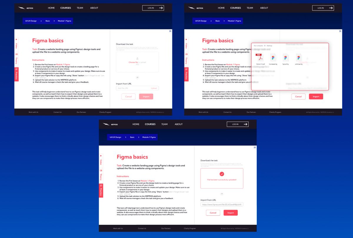
Yo! Another option for "File Upload" design.
Check the animation below
I would appreciate any opinions and criticism
#design #uxui #uiux #uxdesign #uiuxdesign #figma #DesignInspiration #designer #buildinpublic #ChatGPT #Motivation #DesignThinking
#DailyUI 31/100! 1st part
Hi, guys, today's task is "File Upload".
Check the animation below
I would appreciate any opinions and criticism
#design #uxui #uiux #uxdesign #uiuxdesign #figma #DesignInspiration #designer #buildinpublic #ChatGPT #Motivation #DesignThinking
Hi, guys, today's task is "File Upload".
Check the animation below
I would appreciate any opinions and criticism
#design #uxui #uiux #uxdesign #uiuxdesign #figma #DesignInspiration #designer #buildinpublic #ChatGPT #Motivation #DesignThinking
#DailyUI 30/100!
Hello! Today I designed "Pricing page".
Check the animation and other designs below
I would appreciate any opinions and criticism
#design #uxui #uiux #uxdesign #uiuxdesign #figma #DesignInspiration #designer #buildinpublic #ChatGPT #Motivation #DesignThinking
Hello! Today I designed "Pricing page".
Check the animation and other designs below
I would appreciate any opinions and criticism
#design #uxui #uiux #uxdesign #uiuxdesign #figma #DesignInspiration #designer #buildinpublic #ChatGPT #Motivation #DesignThinking
#DailyUI 29/100
Hey guys!
I had to design a map today
Check the animation and other designs below
I would appreciate any opinions and criticism
#design #uxui #uiux #uxdesign #uiuxdesign #figma #DesignInspiration #designer #buildinpublic #ChatGPT #Motivation #DesignThinking
Hey guys!
I had to design a map today
Check the animation and other designs below
I would appreciate any opinions and criticism
#design #uxui #uiux #uxdesign #uiuxdesign #figma #DesignInspiration #designer #buildinpublic #ChatGPT #Motivation #DesignThinking
#DailyUI 28/100
Hiii!
"Contact Us" page is here.
Check the animation and other designs below
I would appreciate any opinions and criticism
#design #uxui #uiux #uxdesign #uiuxdesign #figma #DesignInspiration #designer #buildinpublic #ChatGPT #Motivation #DesignThinking
Hiii!
"Contact Us" page is here.
Check the animation and other designs below
I would appreciate any opinions and criticism
#design #uxui #uiux #uxdesign #uiuxdesign #figma #DesignInspiration #designer #buildinpublic #ChatGPT #Motivation #DesignThinking
#DailyUI 27/100
Have a good week, guys!
Dropdown menu is here.
Check the animation and other designs below
I would appreciate any opinions and criticism
#design #uxui #uiux #uxdesign #uiuxdesign #figma #DesignInspiration #designer #buildinpublic #ChatGPT #Motivation
Have a good week, guys!
Dropdown menu is here.
Check the animation and other designs below
I would appreciate any opinions and criticism
#design #uxui #uiux #uxdesign #uiuxdesign #figma #DesignInspiration #designer #buildinpublic #ChatGPT #Motivation
After much thought and 60 + pages tested, I've decided to remove the #333 color.
I tried my best to keep the design system simple.
60 + beautiful pages with only 25 color styles and 1 layer style.
# Build the Snow Dashboard UI Kit snow.byewind.com
#dailyui #buildinpublic
I tried my best to keep the design system simple.
60 + beautiful pages with only 25 color styles and 1 layer style.
# Build the Snow Dashboard UI Kit snow.byewind.com
#dailyui #buildinpublic
Snow UI landing page Spring discount 👉byewind.gumroad.com/l/landingpage/…
Preview 👉snow.byewind.com
#uxdesign #uxdesigner #UIUXDesigner #webdesign #uidesign #uidesigner #uiuxdesign #designer #designers #webdesigner #ux #dailyui #buildinpublic
#webdesigner #designers #developers
Preview 👉snow.byewind.com
#uxdesign #uxdesigner #UIUXDesigner #webdesign #uidesign #uidesigner #uiuxdesign #designer #designers #webdesigner #ux #dailyui #buildinpublic
#webdesigner #designers #developers
#DailyUI 26/100
We keep going and Subscribe Form Design is here!
Check the animation and other designs below
I would appreciate any opinions and critisism
#design #uxui #uiux #uxdesign #uiuxdesign #figma #DesignInspiration #designer #buildinpublic #ChatGPT #Motivation #Quavo
We keep going and Subscribe Form Design is here!
Check the animation and other designs below
I would appreciate any opinions and critisism
#design #uxui #uiux #uxdesign #uiuxdesign #figma #DesignInspiration #designer #buildinpublic #ChatGPT #Motivation #Quavo
#DailyUI 25/100
Hello-hello!
Super fun task and TV App Design is here!
Check the animation below👇
I would appreciate any opinions and critisism
#design #uxui #uiux #uxdesign #uiuxdesign #figma #DesignInspiration #designer #buildinpublic #ChatGPT #Motivation #DemonSlayer
Hello-hello!
Super fun task and TV App Design is here!
Check the animation below👇
I would appreciate any opinions and critisism
#design #uxui #uiux #uxdesign #uiuxdesign #figma #DesignInspiration #designer #buildinpublic #ChatGPT #Motivation #DemonSlayer


