#buildinpublic
0 people building today
Tweet your progress with hashtag #buildinpublic to show up here.

Using @Figma's variables on my new design has been amazing🥳
See more pages👉figma.com/file/LJ6Drb5z3…
#uidesign #buildinpublic
See more pages👉figma.com/file/LJ6Drb5z3…
#uidesign #buildinpublic
There are many ways to authenticate yourself, whether you use a third-party login or email verification.
How to choose? This is the way I've compiled all the authentication and interaction logic so far.
Take a look👉figma.com/file/LJ6Drb5z3…
#uidesign #dailyui #buildinpublic
How to choose? This is the way I've compiled all the authentication and interaction logic so far.
Take a look👉figma.com/file/LJ6Drb5z3…
#uidesign #dailyui #buildinpublic
AI products can change the way people interact with software, but you still need UI and interaction to build AI products.
#uiuxdesign #buildinpublic
#uiuxdesign #buildinpublic
Snow ChatGPT UI Kit is now released🥳
This is the second product made with SnowUI.
I used all the new features of Figma, including variables and auto layout.
For more features, please preview them in Figma 👉figma.com/file/LJ6Drb5z3…
This is the second product made with SnowUI.
I used all the new features of Figma, including variables and auto layout.
For more features, please preview them in Figma 👉figma.com/file/LJ6Drb5z3…
Create the button component again, for variables.
Snow Dashboard UI Kit 👉 snow.byewind.com
#dailyui #buildinpublic twitter.com/figma/status/1…
Snow Dashboard UI Kit 👉 snow.byewind.com
#dailyui #buildinpublic twitter.com/figma/status/1…

Whoa, over 1 million variables have been created since launching at #Config2023 last week 🤯
twitter.com/figma/status/1…
twitter.com/figma/status/1…
The new features of Figma are great, and I'd love to use them in SnowUI, but it's going to take me some time to get used to them.
Snow Dashboard UI Kit 👉 snow.byewind.com #dailyui #buildinpublic
Snow Dashboard UI Kit 👉 snow.byewind.com #dailyui #buildinpublic
Check your inbox
Maybe there's something good in it😊
Snow Dashboard UI Kit 👉 snow.byewind.com
#dailyui #buildinpublic
Maybe there's something good in it😊
Snow Dashboard UI Kit 👉 snow.byewind.com
#dailyui #buildinpublic
One of the reasons why AI can't replace designers is that AI can't evaluate how good or bad a design is, because AI can't understand how people feel. Unless we tell it to.
I create SnowUI in Figma 👉 snow.byewind.com
#dailyui #buildinpublic
I create SnowUI in Figma 👉 snow.byewind.com
#dailyui #buildinpublic
New design of the Sign In page
1. Removed the "Sign in with Apple" button text
Because such buttons have been around for many years, users already know what they do, so the text prompt can be omitted.
Learn More 👉 snow.byewind.com
#dailyui #buildinpublic
1. Removed the "Sign in with Apple" button text
Because such buttons have been around for many years, users already know what they do, so the text prompt can be omitted.
Learn More 👉 snow.byewind.com
#dailyui #buildinpublic
App Sign up process design
Whether to use password or SMS verification to sign in, this is not only a problem that needs to be considered by product design but also by UX designers.
Which way do you like?
Learn More 👉 snow.byewind.com
#dailyui #buildinpublic
Whether to use password or SMS verification to sign in, this is not only a problem that needs to be considered by product design but also by UX designers.
Which way do you like?
Learn More 👉 snow.byewind.com
#dailyui #buildinpublic
Theme setting - It is difficult for this type of page to have great innovation in interactive design, because the frequency of use of the page must be considered.
Learn More 👉 snow.byewind.com
#dailyui #buildinpublic twitter.com/FarewelltoWind…
Learn More 👉 snow.byewind.com
#dailyui #buildinpublic twitter.com/FarewelltoWind…
Recently I've been working on some pages in the settings, and these pages make me feel boring, I think designers don't like to make these pages.
So let me do it, I'll get them done, and you can save time for more interesting designs.
👉 snow.byewind.com
#dailyui
So let me do it, I'll get them done, and you can save time for more interesting designs.
👉 snow.byewind.com
#dailyui
Sidebar navigation design
This is one of the most important designs in the entire product UI, and the quality of its design will determine the quality of your product design.
Learn More 👉 snow.byewind.com
#dailyui #buildinpublic
This is one of the most important designs in the entire product UI, and the quality of its design will determine the quality of your product design.
Learn More 👉 snow.byewind.com
#dailyui #buildinpublic
Billing Details Design
This is a step in the registration process.
The key point of the design of this page is to make the information filled by the user appear as less as possible.
Learn More 👉 snow.byewind.com
#dailyui #buildinpublic
This is a step in the registration process.
The key point of the design of this page is to make the information filled by the user appear as less as possible.
Learn More 👉 snow.byewind.com
#dailyui #buildinpublic
Mail page in dark mode.
Designing secondary navigation in the dashboard is a difficult point, Consider whether to arrange horizontally or vertically.
This example shows the effect of vertical arrangement.
Learn More 👉 snow.byewind.com
#dailyui #buildinpublic
Designing secondary navigation in the dashboard is a difficult point, Consider whether to arrange horizontally or vertically.
This example shows the effect of vertical arrangement.
Learn More 👉 snow.byewind.com
#dailyui #buildinpublic
Data chart design
Made with Snow Dashboard UI Kit
Learn More 👉 snow.byewind.com
#uidesign #buildinpublic
Made with Snow Dashboard UI Kit
Learn More 👉 snow.byewind.com
#uidesign #buildinpublic
I'm designing ChatGPT's mobile app and this is the first page. I will finish all pages in the near future😊
It will be part of the ChatGPT UI Kit, check the web page 👉 figma.com/file/pTTWqClVP…
Made with Snow Dashboard UI Kit: snow.byewind.com
#dailyui #buildinpublic twitter.com/FarewelltoWind…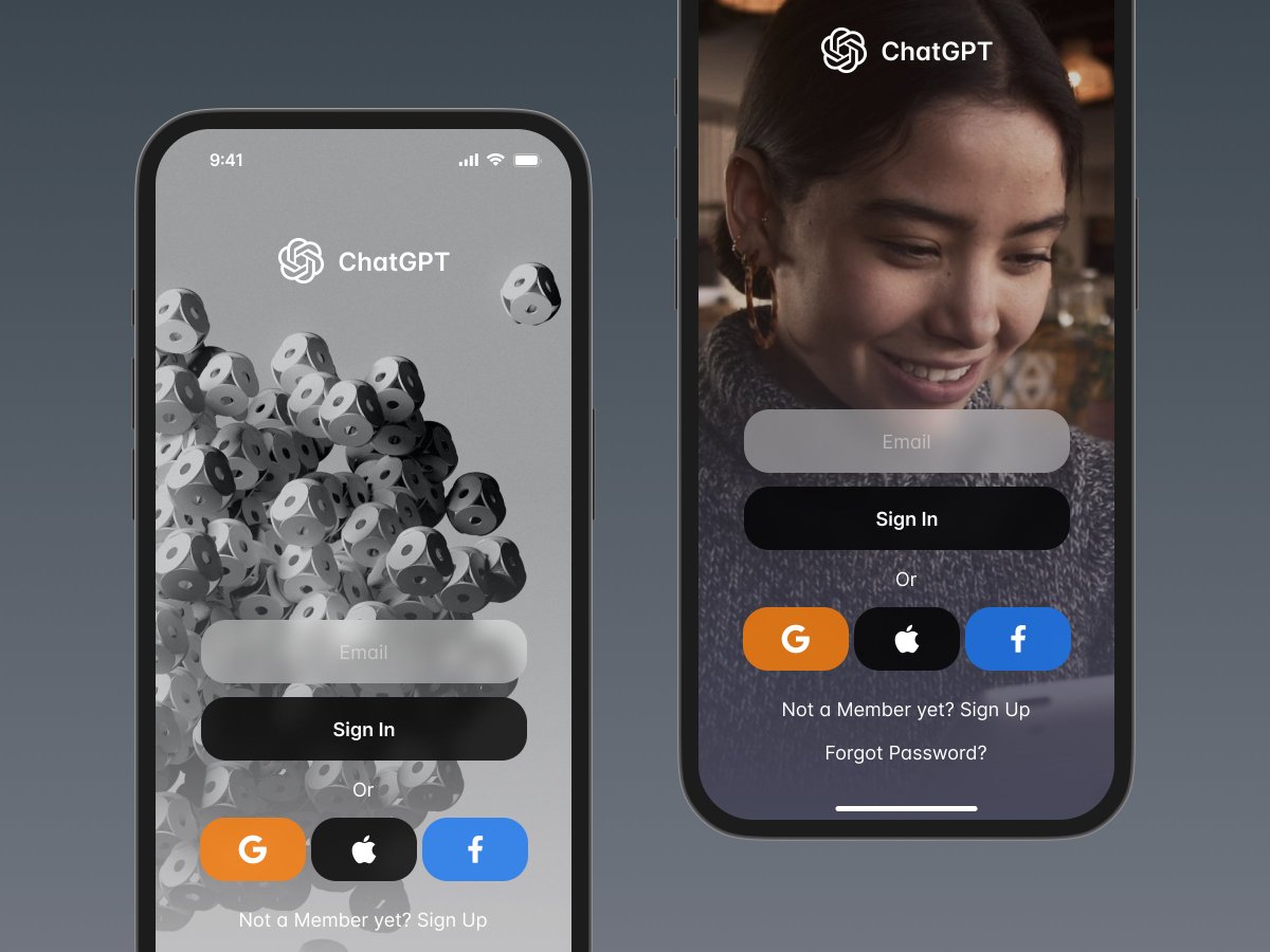
It will be part of the ChatGPT UI Kit, check the web page 👉 figma.com/file/pTTWqClVP…
Made with Snow Dashboard UI Kit: snow.byewind.com
#dailyui #buildinpublic twitter.com/FarewelltoWind…
Snow Dashboard UI Kit now supports #ChatGPT , learn more 👉figma.com/file/pTTWqClVP… twitter.com/FarewelltoWind… 
Interactive guide to tables
Made with Snow Dashboard UI Kit 👉 snow.byewind.com
#dailyui #buildinpublic
Made with Snow Dashboard UI Kit 👉 snow.byewind.com
#dailyui #buildinpublic
Syntax highlighting color scheme
Free Download👉figma.com/@FarewelltoWind
#dailyui #buildinpublic
#webdesigner #designers #developers
#reactjs #vuejs #google #programming #coding #code #python #c #developer #java #javascript #css #html #softwareengineer #coder #programmer
Free Download👉figma.com/@FarewelltoWind
#dailyui #buildinpublic
#webdesigner #designers #developers
#reactjs #vuejs #google #programming #coding #code #python #c #developer #java #javascript #css #html #softwareengineer #coder #programmer
ChatGPT's new page
Made with Snow Dashboard UI Kit - an advanced Dashboard / SaaS UI kit and design system for Figma.
👉 Learn More: snow.byewind.com
#dailyui #buildinpublic #indiehacker
Made with Snow Dashboard UI Kit - an advanced Dashboard / SaaS UI kit and design system for Figma.
👉 Learn More: snow.byewind.com
#dailyui #buildinpublic #indiehacker
After much thought and 60 + pages tested, I've decided to remove the #333 color.
I tried my best to keep the design system simple.
60 + beautiful pages with only 25 color styles and 1 layer style.
# Build the Snow Dashboard UI Kit snow.byewind.com
#dailyui #buildinpublic
I tried my best to keep the design system simple.
60 + beautiful pages with only 25 color styles and 1 layer style.
# Build the Snow Dashboard UI Kit snow.byewind.com
#dailyui #buildinpublic
Snow UI landing page Spring discount 👉byewind.gumroad.com/l/landingpage/…
Preview 👉snow.byewind.com
#uxdesign #uxdesigner #UIUXDesigner #webdesign #uidesign #uidesigner #uiuxdesign #designer #designers #webdesigner #ux #dailyui #buildinpublic
#webdesigner #designers #developers
Preview 👉snow.byewind.com
#uxdesign #uxdesigner #UIUXDesigner #webdesign #uidesign #uidesigner #uiuxdesign #designer #designers #webdesigner #ux #dailyui #buildinpublic
#webdesigner #designers #developers

