#buildinpublic
0 people building today
Tweet your progress with hashtag #buildinpublic to show up here.

I’m continuing my work on the segmented display color font.
This weekend, I’m focusing on stylistic set #2, which draws inspiration from Sharp EL-8 and Sharp EL-160 retro calculators.
Here’s the first draft of the upright black font master.
#typedesign #buildinpublic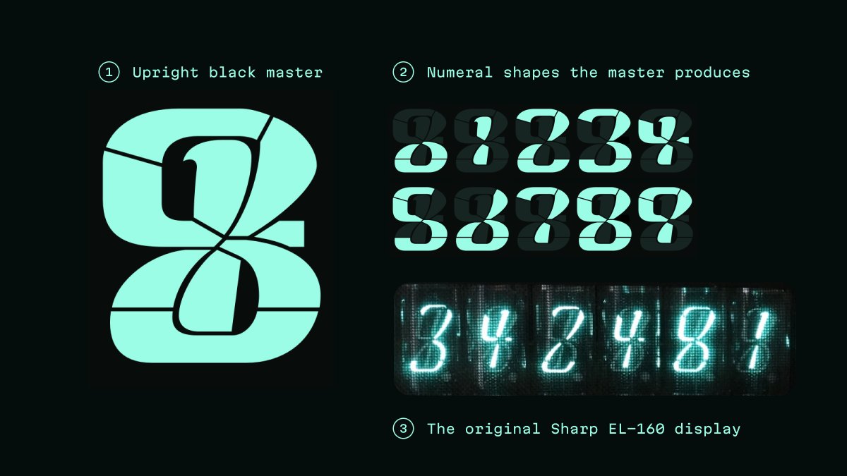
This weekend, I’m focusing on stylistic set #2, which draws inspiration from Sharp EL-8 and Sharp EL-160 retro calculators.
Here’s the first draft of the upright black font master.
#typedesign #buildinpublic
🚀🚀🚀 Our OKLCH Color Picker is on @ProductHunt today!
We would be grateful for your support!
producthunt.com/posts/oklch-co…
#buildinpublic #ProductHunt #uiux #uidesign #uxdesign
We would be grateful for your support!
producthunt.com/posts/oklch-co…
#buildinpublic #ProductHunt #uiux #uidesign #uxdesign

🎉🎉🎉 Martian Mono font 1.0 is out!
In this version I added the basic Cyrillic script for Ukrainian, Belarusian, and Russian languages.
Download it for free: github.com/evilmartians/m…
💙💛 Consider to support Ukraine
#typography #opensource #buildinpublic #typedesign #freefont
In this version I added the basic Cyrillic script for Ukrainian, Belarusian, and Russian languages.
Download it for free: github.com/evilmartians/m…
💙💛 Consider to support Ukraine
#typography #opensource #buildinpublic #typedesign #freefont
Okay, I begin the preparations for the Martian Mono public release.
The upcoming version number will increase up to 1.0.
Cross your fingers!
#buildinpublic #typography
The upcoming version number will increase up to 1.0.
Cross your fingers!
#buildinpublic #typography

Another milestone passed: the Martian Mono’s Cyrillic is almost ready!
All glyphs for 6 masters are finished. The next step is balancing letters’ visual weights by examining text massives.
#typography #typedesign #fontsdesign #opensource #martianmono #buildinpublic
All glyphs for 6 masters are finished. The next step is balancing letters’ visual weights by examining text massives.
#typography #typedesign #fontsdesign #opensource #martianmono #buildinpublic
Yay! I was lucky enough to take my favorite corner spot in my second favorite coffee shop. I love it because it’s quiet and in front of the window.
I’m going to work on #Cyrillic в and з for the next few hours from here.
#typography #typedesign #buildinpublic
I’m going to work on #Cyrillic в and з for the next few hours from here.
#typography #typedesign #buildinpublic
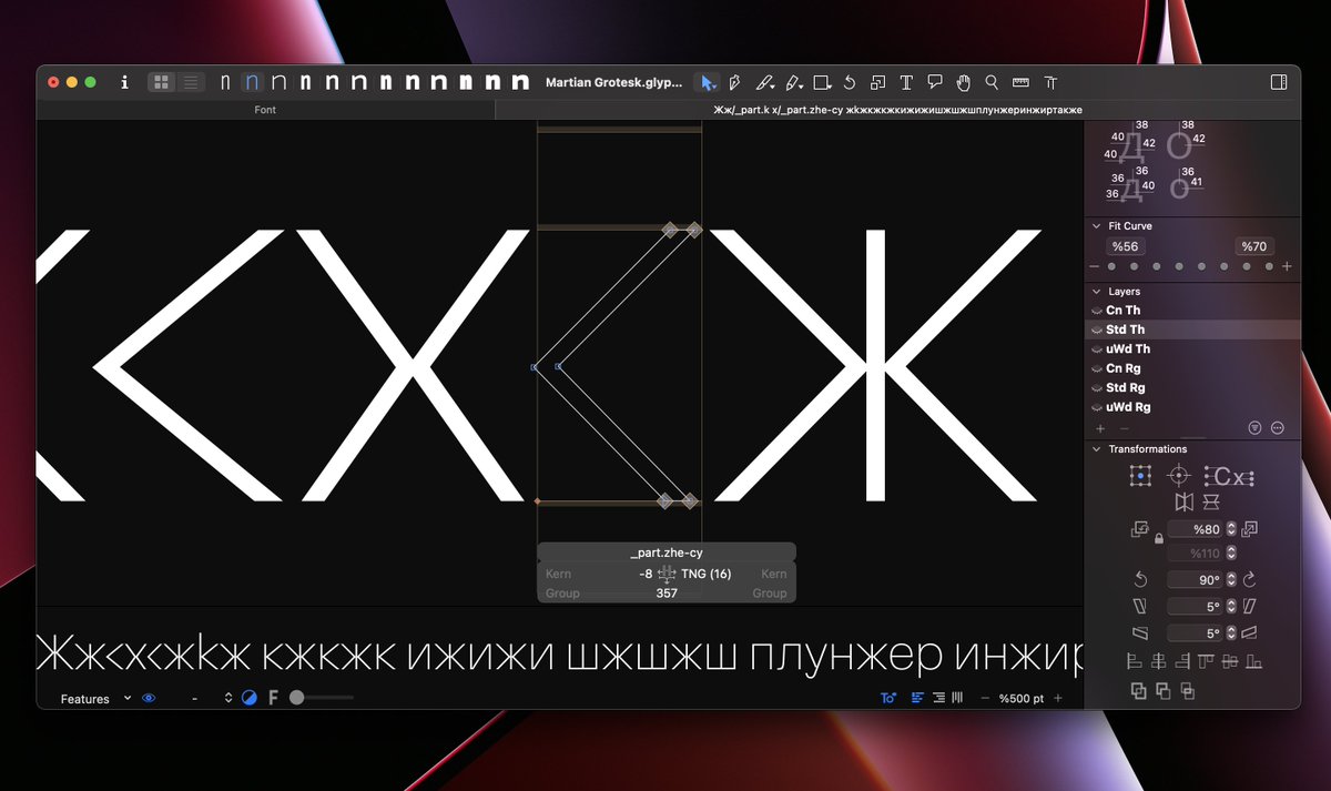
#MartianGrotesk Cyrillic script progress: finished uppercase.
#typedesign #typography #buildinpublic #cyrillic
#typedesign #typography #buildinpublic #cyrillic
Martian Mono 0.9.3 work in progress: cyrillic uppercase.
#typography #typedesign #buildinpublic #opensource #LearnToCode
#typography #typedesign #buildinpublic #opensource #LearnToCode
Martian Grotesk 0.9.3 work in progress: cyrillic uppercase.
#typography #typedesign #buildinpublic #designfeed
#typography #typedesign #buildinpublic #designfeed
🎉🎉🎉 Martian Mono 0.9.2 has arrived 🎉🎉🎉
Now the typeface supports 218 languages. Download it for free: github.com/evilmartians/m…
The next stop is the Cyrillic script.
#opensource #typography #buildinpublic
Now the typeface supports 218 languages. Download it for free: github.com/evilmartians/m…
The next stop is the Cyrillic script.
#opensource #typography #buildinpublic

A bit of progress.
Added Ċċ, Ėė, Ġġ, İi, Żż, Ĺĺ, Ńń, Ŕŕ, Śś, Ẃẃ, Źź, Ŵŵ, Ẅẅ, Ẁẁ, Ŷŷ, and Ỳỳ to Martian Grotesk and Mono.
#buildinpublic #diacritics #typedesign #typography #opensource
Added Ċċ, Ėė, Ġġ, İi, Żż, Ĺĺ, Ńń, Ŕŕ, Śś, Ẃẃ, Źź, Ŵŵ, Ẅẅ, Ẁẁ, Ŷŷ, and Ỳỳ to Martian Grotesk and Mono.
#buildinpublic #diacritics #typedesign #typography #opensource
Yesterday’s progress. I added some #diacritics to Martian Grotesk and Mono.
#typedesign #buildinpublic #opensource #multilingual
#typedesign #buildinpublic #opensource #multilingual
Working on kerning for glyphs with vertical caron.
#workinprogress #buildinpublic #diacritics #typedesign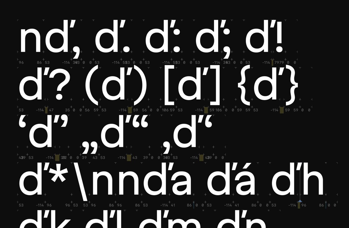
#workinprogress #buildinpublic #diacritics #typedesign
💥 Martian Mono 0.9.1 is here! 💥
The source of the best #monospaced font for code (in my mom’s opinion) is finally OPEN!
Also, extended Latin support, new OpenType features, and news about ligatures for code.
👉 github.com/evilmartians/m…
#opensource #buildinpublic #javascript
The source of the best #monospaced font for code (in my mom’s opinion) is finally OPEN!
Also, extended Latin support, new OpenType features, and news about ligatures for code.
👉 github.com/evilmartians/m…
#opensource #buildinpublic #javascript
Ð is done, ð is in progress.
Is it me, or does it seem falling to the right a bit? Maybe I should bend its top to the left to balance the entire glyph.
#buildinpublic #typedesign #fontsdesign #fontdesign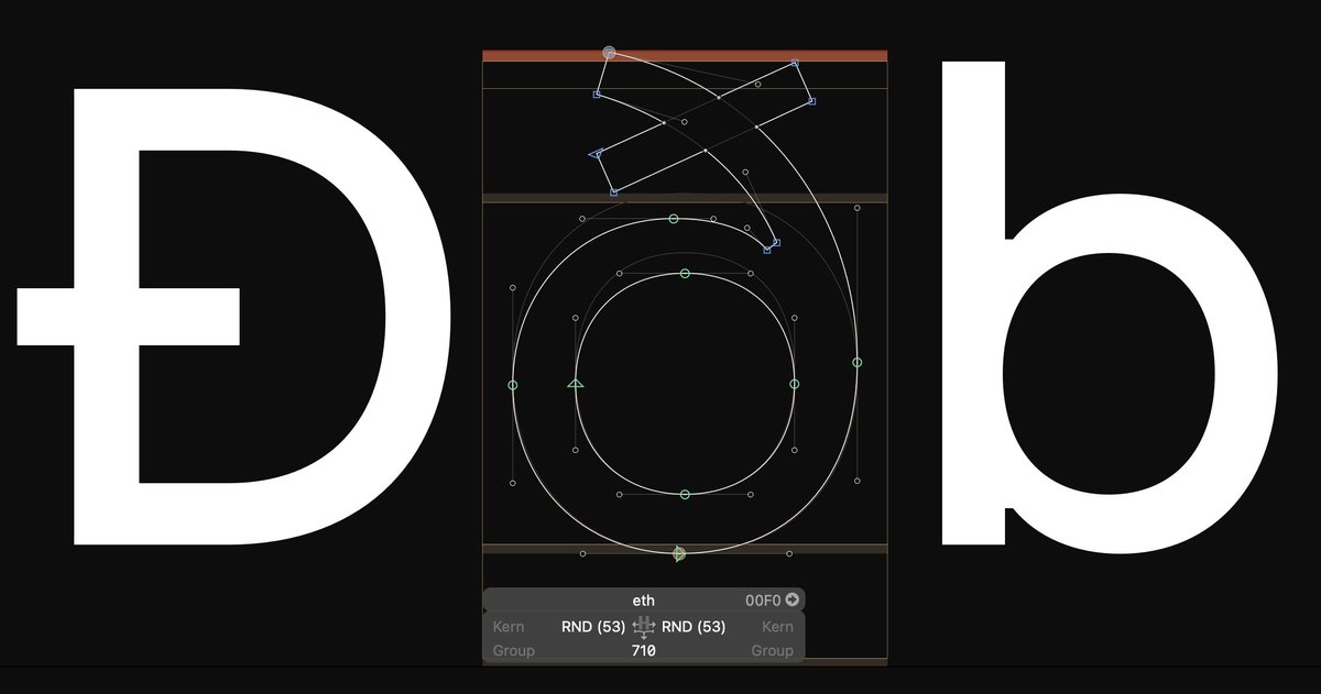
Is it me, or does it seem falling to the right a bit? Maybe I should bend its top to the left to balance the entire glyph.
#buildinpublic #typedesign #fontsdesign #fontdesign

